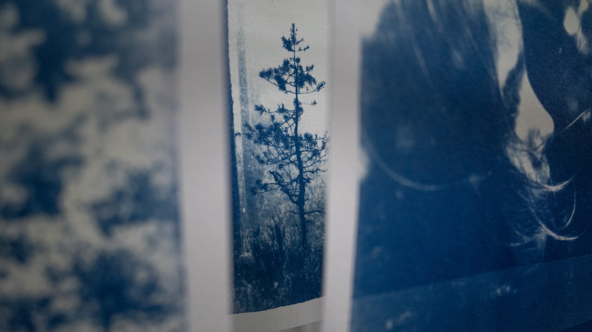
Cyanotype as a means for image printing from negatives or transparencies has sparked some recent interest, with an unexpected adventure onto the trail of tone, and fending off frustration.
Last summer marked the beginning of an artistic venture into the enchanting world of cyanotypes . This traditional photographic printing process, which produces cyan to Prussian blue prints using the UV from sunlight, became a gateway to exploring the striking interface between art and science.
Drawn by an eagerness that borders on impatience, I gravitated towards the wet cyanotype process. This method, intriguing in its own right, allowed for a much more immediate and dynamic way to produce images. Instead of waiting for layers to dry, I found joy in manipulating the chemicals and watching the reactions occur in real-time as the sunlight catalysed the process.
Emerging blues played against the vibrant rusts of turmeric stains. The unpredictable, other-worldly patterns created by combinations of soap suds, vinegar, and whatever else I could find in my cupboard, added a unique character to each piece. Each element brought into play reacted in its own distinctive manner, infusing the artwork with a life of its own. I was hooked.
Soon winter came, the novelty wore off a little and I went back to focussing more on my “traditional” photography – you know, the one that involves a camera. But with winter also came a renewed interest in the analogue process.
You could say that winter in the Scottish Highlands can sometimes feel a bit like the lockdown days from our very recent past. The dark days and darker nights, the cold, and the storms feeding into the feeling of isolation. And as such, with every cold season comes an enthusiasm for *something* that the persistent mayhem of summer overshadows. A gift of time to learn something new or renew a skill. A disruption to the ancient silence that gets my mind tingling.
So, clunky analogue cameras long lost to the shadows of the loft we dusted off, cleaned up and brought back to life. Film was discovered exposed, unexposed, leaked, poorly stored, and downright weird. My brain went through something of an unsettling experience trying to remember the process and science of development. But, it felt ever so good to get it whirring again. And thus, the tangible result of a piece of film, held up against a window, brought magic back to physical process. I found myself away from my computer (apart from endless scanning, but that’s for another blog post) and engaging with image making in a whole new way.
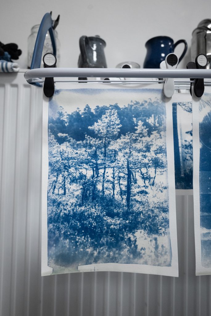
So here we are, nearing the end of winter (she says, looking out on the dreichest of days) and the past few days have seen me using the cyanotype process to produce tactile representations of my images. By utilising high-quality acetate to craft a large negative, my image could be contact printed straight onto the treated paper. This method felt like a more intricate connection to the photographic roots of the medium, as opposed to cyanotypes made from natural elements, which often possess a more abstract or interpretive aesthetic with varying levels of unpredictability. With the help of a UV light, I went seeking for the opposite – predictability. I knew what I wanted to achieve, I just hadn’t figured out the recipe…
With cyanotypes, paper, chemical and light work in a fine balance. I’ve found some papers need long exposures, and others produce high contrast. For my images, I wanted to capture the tone. The detail in the shadows. The thing that would take them to the next level of believability. When I could shout “yes, this really is a photograph!” and not an obscure chemical reaction I had no control of, but stunning none-the-less.
It turns out beautiful photographic tone is hard to achieve in the cyanotype process. But luckily, for the first time in a while, I’ve felt no need to rush, my patience has very much been hanging around. My test printing has almost been meticulous. I’ve even made notes. Unheard of for my self-diagnosed chaotic mind… all of this in search of that elusive, but necessary, tone.
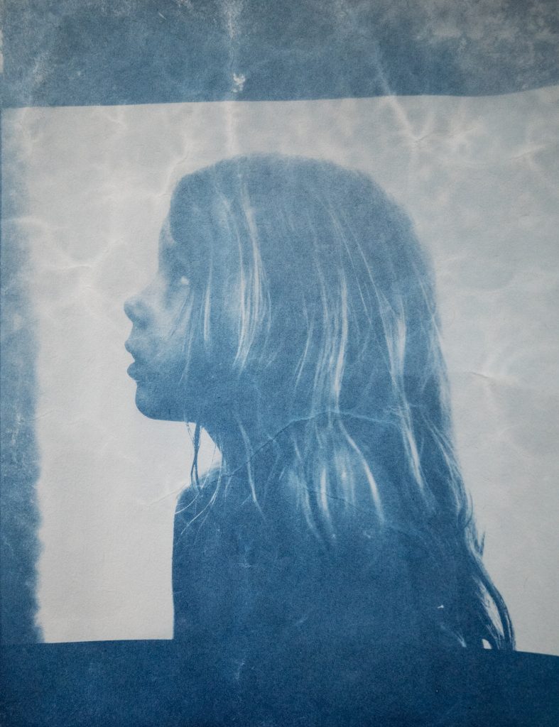
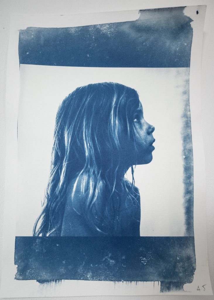
In one of my early attempts, I found really nice tone (treasure!) in my daughter’s hair. The first image above. But, alas! I had coated the wrong paper and it almost entirely disintegrated during the rinse. I also have no idea how long I exposed it for (a little hint of “winging it” Jess, and that chaotic mind I mentioned) But despite this, I still love it, and will keep it. The image of my daughter is great for testing with as a start-point. It has light, shadow and detail. And the 4.5 minute version above (with an upside down contact, oops), on a 50% cotton watercolour paper (just what I had to hand) shows promise. But is still frustratingly holding onto contrast.
So, with socks pulled up, superhero stance initiated, I declared to myself that I wanted something more robust, I wanted to create large versions of my forest images. And for that I would need to get organised, and nail down that tone, once and for all. And for that, I would need to be organised…. yikes.
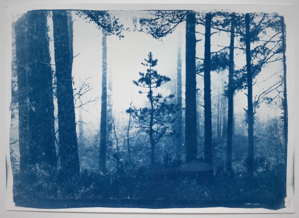
During the last few days I’ve had to exercise extreme (for me) patience. Coating paper and leaving for 24 hours (unbearable) and not utilising the fridge as a handy dark space to dry paper. It turns out it does weird things and creates a strange contrasty grain to the image. And this subsequently cannot be resolved by leaving the paper to dry out more at room temperature. Damage done. Badda-bing badda-bang.
I’ve been working with only 3 sheets of coated A4 per day, and they soon get exposed, notes made on them, and dismissed to the big blu-tac wall where I can look at them and wonder if it’s worth it. It’s only been 3 days… Today I cobbled together a large dark-box for more paper to dry, offering a more substantial stock to experiment with, and likely dismiss.
However, despite what it may seem, I do feel I’m getting close to unlocking what I need to create the prints I want. When someone told me that contact printing with cyanotypes was difficult, I honestly didn’t believe them. Yes – there are recognisable images here, and they have their own contrasty charm, in lots of ways I like them! But I’m now chasing that detail, the thing that will uplift them.
So what are my next steps? Persist! I have some ideas about how to mix the chemicals slightly differently, and have seen some examples where this has been the key to tone. I’m also going to restart the test printing process on 100% cotton paper.
Another line of enquiry is the transparencies themselves. Adjusting their levels and looking at dodging out the dark areas more. I feel like the very thought of this will send me spinning, as so much of this process has been like working blindfolded, only for the reveal after a long process to be disappointing. Therein lies the pain of the art. And maybe a *little* bit of the joy too.
Hopefully, sometime soon, I will update with more progress and findings. I have a lot to go on, and still many things to try.
Thanks for reading!
Jess ꩜
Leave a Reply